Monday, 19 November 2012

Inside Out - Day Project

First day in our specialised subject!! - for me, Illustration! Lots of new people to meet and it was rather scary! To get us to start talking to people we were given the brief to create 3 portraits using random objects ranging from buttons, shells and pine cones to light bulbs, wooden toy horses and golden syrup tins - a self portrait and then the portraits of the two other people on your table. We began by asking each other questions to start and work out what we were all like and how to put this across in our portraits.


These were my self portraits. I always find self portraits difficult because they're so personal. I decided to base my portrait on how I was feeling that day - which was very nervous although trying to keep up a brave face!

Following are my portraits for Lucy, who is a very friendly, funny person in a quiet sort of way so I was trying to get that across but she's also very clever and witty so I wanted to be able to portray her intelligence as well.  

I felt that this portrait seemed too serious and didn't get the idea of Lucy's kind and friendly personality. However, I did like the simplicity of the piece because I feel like Lucy is quite a calm, together person. 

This portrait definitely captured Lucy's friendliness more but I felt that it was too cluttered as a piece with the buttons and the rest on the left side. However I did want to include some of these objects because to me the symbolise Lucy's clever, witty side. 

I simplified the piece keeping what I believed to be the most important elements. 


This was originally my final piece but I think I actually prefer the one above more now looking back at them all together. The one above seems to have more balance and just seems to be more appealing to the eye.

And last, but not least, there are the portraits of Megan. I based Megan's portrait more on her physical attributes because I didn't know her as well as Lucy. Megan has an impressive amount of piercings in her ears and nose so I tried to use a lot of metal objects to represent that. She also wore a lot of black eye liner which I tired to capture as well. However, She loves Disney and magical creatures (like unicorns) so I tried to show that she has an interesting mind and has a love of music in my pieces too.   


It was interesting trying to think of which object best represented certain aspects of a person's character; I liked that it made me think about what I wanted to express about someone's personality but I also found it quite difficult because the audience might interpret the objects differently and so not get what I was trying to say about the person. But I supposed that's a problem you'll get with any piece of art! I did enjoy it though because it shows you don't just have to draw in illustration!

Saturday, 10 November 2012

3D Design Week


If I'm honest 3D Design was the week I was looking forward to the least. However, I really wanted to try and get the most from it that I could.
We started off by researching a designer and then giving a small talk to the rest of the group as to why we liked them. I looked at a few before I found Ross Lovegrove (see 3D Designers blog for more info). I liked finding out about which designers people liked and why.
Kathi (our teacher) then went on to show us how designs had changed and improved over time, It was interesting seeing how things progressed and how they can effect our lives for the better or worse (or quite often both). We discussed the good points and bad points of different designs.
After lunch it was one-point and two-point perspective drawing! This was to show us what kind of skills we'd need if we took 3D. It was pretty easy to get the idea of but I suppose if might get quite tricky if you're drawing a complicated shape - luckily we weren't! :)


We started day two by having a quick introduction into Illustrator. This was really useful because I know that I'll need it in Illustration as well as Photoshop.
After that we drew an object with a graphite stick, then a pen and finally ink and a thick piece of cardboard. I really struggled to draw this week; I felt like I wasn't being technical and precise enough for 3D Design.  I also found that I was very uninspired because we were drawing nuts and bolts, gears and random pieces of metal. I just find mechanical objects uninteresting - I'm much more into organic shapes and natural forms - and although I really wanted to get into the zone, I just couldn't seem to get it. It was very frustrating to me because I feel like I should be embracing as much as I can. I'm very disappointed with myself in this respect.


Later on we looked at shapes from our previous work to make into 3D paper form. I found this quite difficult because I didn't have a lot to go on. But I found some wavy, curved shapes that I liked and so I started to think about what I could do with those.
On the third day we got put into groups of three and told to design a 3D form that could have a function if properly designed. We were a bit unsure what to do to begin with because it was so open but we collaborated on inspiration and ideas and started working. We worked really well as a group and we had lots of ideas - unfortunately we had little success as they were too complicated for our skill set! It was rather frustrating but we regrouped ideas and started on something more simple. We didn't have a lot of time left so we didn't get to finish our work. I think it was good to aim high but not so high that you can't achieve your goal. I also think I work better when I have more of a brief so that I know what I'm doing and what direction to take. I also found it very difficult to work with the paper to create an interesting form; especially making tabs to fit the elements together without glue or masking tape! But this was useful to know because they were very effective! I don't think I'm very 3D minded! This week has definitely shown me that 3D is not for me but it's been a useful learning experience so I'm glad I had the chance to have a go at it.
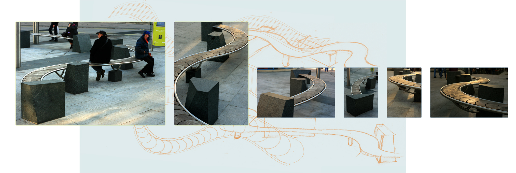
This was our inspiration for the first piece - we thought it looked a bit lake a blue tooth  headset  and so we decided to see if you could have a go at making one out of paper.
It was quite difficult working out quite how it would look in 3D form and we did a lot of models to try to get it right.  
Curved lines just weren't working; we couldn't get the shape to curve in the right way so we decided to try more angular lines. This seemed to work better although it didn't look as good.  
In the end our original idea just wasn't working so we abandoned that idea and concentrated our effects onto a much simpler idea.  


Friday, 9 November 2012

3D Designers

Ross Lovegrove:

I really like that his work has a strong influence from natural forms; his work feels very organic and yet at the same time quite minimal. I feel that there is something very calming about his work. Everything seems to flow and work together. I think his use of clean, smooth line is nice and it makes his work feel very fresh and modern while still in keeping with a natural theme.


Fred Baier:

Fred Baier often works with colourful, geometric shapes which I'm not too fond of although I realise he does makes some really good quality stuff. But while looking through his website I did find some of his work that I did like:
"Public Seating
Meandering, babbling brook
dry water feature"
I really like this because I think it's really simple but very elegant and effective. I love the way it curves, just like a stream. I like the wooden shapes in the middle; it makes the piece feel very natural and unobtrusive and the black supports look like rocks in a stream so it all works nicely together.  It feels a lot more organic than some of this other work and that kind appeals to me much more. 
Ettore Sottssas:

His work feels fun and funky although he uses quite a lot of geometric shapes too. However, I like his work more than Fred Baier because he uses brighter, more youthful colours, which makes it feel exciting and fresh.


Bauhaus: 

Bauhaus was an art school in Germany which was very influential on the way art was perceived. Before the arts were separated into fine art, graphic design, illustration, architecture et cetera and Bauhaus brought all the art and design practises together and showed people that they linked very closely with each other.

Bild1
Wire Chair by Harry Bertoia
If I'm honest, I don't like most of the designers that came from Bauhaus because there work is very modern, clean and stripped back. I find this very lifeless; I feel like the environment they create is very aseptic and it just doesn't appeal to me.
However, I can appreciate that there are very well functioning designs that are useful to very day life and therefore are good designs.
Bild1
Brno by Ludwig Mies van der Roche


Wednesday, 7 November 2012

Life Drawing - Week Seven

iPads:

We started life drawing week seven day by using iPads! It was really strange using this tiny screen as a piece of paper and your finger as a pencil. I felt like a lot of the time I couldn't get the right shape or enough detail into what I was drawing. I didn't really like having to use the zoom either because that meant you couldn't see the rest of your drawing. I found using the iPad very frustrating to begin with.
This was my first attempt - I really struggled to start this off because the screen so so small, I felt like I wouldn't be able to get the image small enough to fit on the whole page (even with the zoom). I found it really hard to work of the proportions and I kept having to undo lots of my work so I didn't manage to get much done! Grrr.  
With the second image I found out about the layers tool and this was really useful. I started off with a thick basic line and built up with layers from there. I managed to get much more of the figure and I feel that it's starting to work quite nicely. 
I found that as I went on, I got used the different way of working. I started to use different layers to build the image up. I started off with a thick opaque line to get a very basic outline. Once I was pleased with that I would start a new layer with a thinner, blacker line to refine the form. Once I was pleased with this line I rubbed out the first layer. Then on a third layer (if I had time), I began to build up opaque colour and tone into my work. I'm not exactly sure if I'm pleased with the results because I feel like they are cartoon-like at the moment because we didn't have much time to work on each image but I feel like for a first go, they aren't too bad. It was really good to try something completely new and although I didn't enjoy it as much as actual drawing, it showing an up-and-coming way of drawing.   


I think my third drawing is coming on really well. I got most of the form in pretty quickly with the thick outline and so managed to refine it quickly as well. I even got on to adding colour and tone. Obviously it's still a bit blocky but I feel the  basic form is there - more detail just needs adding. 
With this image I was trying a different technique; I thought Id try to block in the body with colour first and then refine it with line after. I think it's started off OK. Might have become a bit trickier with the legs and feet. I would have liked to work on this one a bit longer to see how this technique would have worked out.
Graphite:

After lunch we swapped our fingers and iPads for paper and graphite sticks. I'm not the biggest fan of graphite sticks because I think it's similar to charcoal but that charcoal is much better - more expressive, looser and bolder. But I was pleased to use it because the technique we were using with the graphite stick was like the one we used for charcoal; not using much line, picking up the shadows and creating an image that way. I really like this way of working but I don't don't use it very often so I really love having the chance to draw this way. 

I like how I have gone darker with the shadow in this piece. I would have liked to worked into this even more but I ran out of time. 


Overall, I'm not too pleased with these images; I feel like I lost my way a bit in terms of proportions and shape, particularly with the last piece. I quite like the first two because I think they are quite expressive but I feel that they just don't work as well as my charcoal drawings earlier on in life drawing. Still it's always good to make yourself work with media you don't like as much because you may discover something you didn't know.