Wednesday, 24 October 2012

Life Drawing - Week Six!

Life Drawing - Week Six - Colour!

This week we had to use a range of different coloured oil pastels to represent the body with - but we weren't allowed to use skin tones! I went on the basis that purple/ blue/ green would represent the darker tones, red/ orange the mid-tones and yellow/ white the highlights. So on my first attempt I was trying to draw with line and then working in on the shadows. However, as we were not given much time, I spent way to long on the form and didn't get chance to even get started on the tone.
15 minute sketch
Therefore, on the second go, I didn't use much line. Instead, I used the technique I used last week with the charcoal; shading in the darker areas and then building into it from there. I feel this worked a lot better and I as able to work much quicker. I decided that this week, like last week, was more about the expression rather than the complete accuracy of the piece. I quite like this piece because you can tell that it is a human form even though the colouring is completely crazy. I know there are several things wrong about the piece but I feel that is quite a good effort considering that oil pastel is really hard to rub out or change.
30 minute sketch
Having worked out what technique to use and the idea behind what we were doing, I felt a lot happier. We moved our easel positions so that we would get a different view of the body and began a new sketch. I'm quite pleased with the outcome of this one but I wish I'd been able to complete a little bit more of the rest of the body. I think the bright colours create a weird effect but it's definitely very striking.
I didn't really like using the oil pastels; I find them quite blunt, clumsy instruments to use and I don't like that they don't blend together very well. But it has been interesting using them to create this images.
20 minute sketch 

Tuesday, 23 October 2012

Textiles Week

We started Textiles week by doing some warm up drawings in our sketch books; similar to the ones we did in Illustration. Then we moved this onto a larger scale out of our books like we did in Illustration. However, this time we used old pieces of envelopes as the base and we used a range of coloured inks, pastels, oil pastels, collage, masking tape and pencil. We had two still lives set up for us; one with bright coloured fabric and wooden, painted toys and the other had more organic objects such as skulls and dried plants with more earthy coloured fabric. The emphasise was on looking at shape, composition and colour rather than focusing on the actual, individual objects themselves. We kept changing the position of the paper (upside down, sideways etc.) so that our pieces didn't become too detailed and tight. I really liked the way all the pieces turned out and I'm really pleased that they were all quite different - one focused on colours, the other on line and the last on shape.


line
colour

shape
In the afternoon we did some mono-printing. I loved doing this! I really liked the effect of drawing with  a continuous line and in my left hand - I love the quality and looseness of the line especially as I'd chosen elements from the wooden toy still life for my mono-prints so I wanted something that felt quite young and playful - so I used this technique for my mono-prints. I really like how each print is unique - I think there's something really lovely about that. I like my three bird prints because I think they're really simple but they're really easy to look at; they're pretty and uncomplicated which can be a really nice escape from all the angst you get in art sometimes. I quite like the two fish heads print; although I am a bit disappointed with the orange background; that was supposed to be more subtle but I added too much ink on the board. I'm quite glad I made this mistake because it taught me to be really careful about how much ink I should use and it made me realise that when mono-printing you can't control exactly what your work is going to look like. Which is, in some ways, is really exciting and fun for you as an artist but can also make you feel quite nervous about adding to work that you like as they are although but you still need to continue with. I don't feel that the other two pieces were as successful. I don't like the composition of the piece with a bird and a fish on it; I think it looks a bit messy and not well thought out, and I don't think the colours sit right together. I don't like the orange and blue together on the last one either. Although I do like how bold and different it is to the others but there's just something about it that doesn't work for me.    

The next day we had to use inspiration from the shapes/ colours/ lines/ composition from the previous day's work to create two banners. However, during this session we had to include fabric and stitching. I really liked the pinks, vivid blues and dull yellows in one of my pieces but I liked the lines and shapes of the birds so I decided to combine these two elements in my banners. I love the colours together on the banner and I think the background works really nicely compositionally however, I don't think the two banners work well together yet. I think I need to work more into it with the stitching and printing and drawing with line because the two banners seem empty in a busy way. I think all it needs is a bit more work into it and it'll be really nice. I really like the subtle pink stitched bird (although it took me ages!) - it adds interesting texture and detail to the piece - I would like to include more of this in my work.
As I was waiting for the banners to dry when I first painted on the vivid blue ink, I started two other smaller pieces. I'd seen other people using brown paper and newspaper and thought the effect was interesting so I wanted to experiment with it myself. I wanted to keep some of my original work in the piece so I added blue fabric and decided to use the fish head image and mono-printed that on the work in different places and positions to get the feel of our earlier work coming through. I was really pleased this effect but I thought it still looked a bit lacking in colour so I added some red/pink ink to link back again to the original work and stitched on some interesting loose shapes in thread (in dark blue - again selecting a colour from my earlier work). I thought the ink would be quite bright and vivid but it came out quite dull which to begin with I was quite disappointed with but as I carried on I really liked the effect. It made the picture feel aged and almost vintage which I loved. I really like these two pieces; I feel like they have been  very successful because the colours worked really well together, I like the composition, I think the texture is interesting and I love the effect of the mono-print.            

I didn't really think textiles would be something I would be particularly interested in (although I was looking forward to it and I do like lovely patterned cloth) but I found myself really enjoying the week and have ended the week thinking seriously about surface design as an option. I really like that surface design can be quite illustrative and although I still want to specialise in Illustration, I'd love to spent some of my time working on some surface design within Illustration. 

Monday, 22 October 2012

Graphics Workshop


We had a talk from a Graphic Designer today, Jesse Boyce. He's a co-founder in the company Lethal. What was really useful from his talk was him telling us about different ways you can present your CV to show off your skills as a designer. I'd just thought you typed a straight forward CV but he showed us ways in which you can show your style and personality such as adding drawings, interesting layouts, colours, fonts etc. This is something I'd never even considered I could do for my CV so it really opened my eyes. It will really help later on when I am applying for jobs to get me noticed and remembered and then (hopefully!) employed.
I also think his talk showed me that Graphics isn't really the route I want to go down. I enjoyed listening to what he had to say but his kind of work didn't really appeal to me. I thought it was good but I don't think I would like the process. I really want to draw and collage using inks, charcoal, pencil, pencil etc. I'm really not into using the computer at all really. I don't mind using it a little bit and I think it is a good skill to have, definitely, but I'd rather draw. And he said that he mainly worked on the computer.

After the talk we had a a voluntary workshop. I decided to join it because I thought it's a good idea to take all the opportunities you can. The brief was to make the union jack our own. Jesse Boyce talked about how he thought the flag looked like a explosion to him and I liked that idea and thought about ways I could make this more apparent in my flag. I thought about ripped paper and different colours and line in order to try and express that. However, in the end I just felt like my piece was a bit of an imitation of the flag and someone else's idea. I thought it lacked originality and was uninspired. I was left feeling quite disappointed with myself. However, a good thing that came out of this session was that I did some interesting pieces.
I thought this piece was really interesting. I like the way
she's used the diagonal lines of the flag but changed and
added some of the angles and lines. It feels very clean and
colourful.  


My work 
I really like the media that this has been made in. I think it manages
to stay really simple but it's interesting too. I love the depth you
get and it makes you want to touch it and look at it. 

Saturday, 20 October 2012

Photography Week


This was a week I was really looking forward to because I've never done photography before; I've taken pictures, of course, but not studied the art of image making. I didn't feel like I really "got" photography so I was also a bit nervous because I just had a feeling I wouldn't be very skilled at it! 
We were introduced to photography by Andy who showed us how to set up a 35 mm S.L.R camera. He taught us how it worked with the mirror and the shutter and told us about the different exposures, aperture and how to focus. We also put film into the cameras following a demonstration by Andy which I really liked because it felt like we ere really getting an idea of how to set up a camera. I liked that it was hands on learning.
After learning about the camera we were allowed to roam free around the college with our camera partner to take photos of anything that was interesting to us. The only rule was to take at least 2 portraits of our partner using a different aperture for each photo. It was really nice being able to go out and take photos although I wasn't really sure exactly what it was that I wanted to take a photo of or what made a good photo so I was a bit nervous but also excited.
After lunch it was Photograms! This was so much fun. I just tried as many different objects in different compositions as I could. I liked using transparent objects such as the glass bowls and plastic bottles because you it didn't get white a completely white silhouette; there was more detailing with these objects which I thought was really interesting and at times really beautiful. I thought this was a really simple, but lovely process and I really enjoyed the whole day.
On the second day we went out into Chesterfield Market to take photos with a digital camera. I found this more difficult and awkward because I was photographing people I didn't know and the set up was random because people moved in way you didn't want or moved so quickly your moment was gone. I felt a bit lost because I was even less sure what I was looking for. And I didn't like using the digital camera as much; it felt too instant and easy and modern. I really liked the process of the 35 mm S.L.R camera; it felt more deep (if that makes sense). I also find that I'm a lot more comfortable taking photos of fewer people or landscapes or nature. So maybe this was a good exercise to take me out of my comfort zone.
When we got back from town we had a session in a computer room to edit our photos in Photoshop.
On the third day we drew with light - this was awesome. So much fun! And I thought the pictures themselves were really interesting and lively; I really like the effect.
After drawing with light, Andy showed us some of the work of Thorsten Brinkmann (http://thorstenbrinkmann.com/) and told us to use this as inspiration for our own work. It was important that all of the body was covered up and that we thought about the poses our model were in and what kind of feel we wanted to give off. We were also supposed to think about props.
Above is my work - I dressed Alice and I wanted to go for a mysterious, perhaps a bit seductive in a bizarre way (hence the jug - was thinking about the stereotypes of milkmaids - and the colours - red = passion and lust, black = mystery and purple = intrigue). This was fun because it was different and odd.
 
Below is me dressed by Alice :)
I have really enjoyed this week. I've loved learning more about photography and it's been a really good week. I feel like we explored a lot of different approaches to photography and I think this was really good because we got the chance to find out what we can do with photography. I don't think I'll specialise in this area but it's been great to have a go at and it's something I'd like to do more of in my free time maybe.   

Thursday, 18 October 2012

Life Drawing - Week 5

Life Drawing - Week 5 - Clay!!

We were warned that this week's session would involve clay so I wore very old clothes as clay stains everything brown-red! I was a bit unsure about this session because I've not really had much success with clay before (although I haven't actually used it that much). However, I was determined to give it my best shot and see it as a learning experience.


We began to make a whole figure in a reclining pose. We started with a very basic lumps of clay to represent the torso and pelvis joined together with a ball of clay to allow movement. Then we added long rolls of clay for arms and legs. This was our base to add onto and shape and mold into a figure. We moved around the donkey stools placed in a circle around the model to get the whole perspective every few minutes which was good but frustrating if you were really into a your work at the particular view. I'm quite pleased with how I got on because I think I got the basic figure and proportions right; however, I would have liked to have got a bit more detail in.
After three hours or so, we stopped the figures and started focusing in on the head and face. I found this much harder and I did get quite frustrated. However, I did find working with the clay therapeutic. I felt like I was working really slowly and even though we had a long time to work on the face, I hardly managed to get anywhere.


What I really liked about this session was that we were able to do some sustained work. I've really enjoyed doing the quick sketches in the other weeks because it was a really good learning experience for me, but it has been really nice to focus my attention on a longer task where I could have time to think about what I was doing. And believe me I needed the time! I was quite pleased with my full figure clay model because I think I managed to get the proportions in correctly and I liked the curves of the clay. I was a bit disappointed with the head because I felt like I'd spent a lot of time on it but I couldn't get the clay to move where I wanted it too. I think I was working too small; if I was to do it again I would definitely work in a bigger scale because the detail wouldn't have to be as fine.

Wednesday, 10 October 2012

Photographers!

Tis photography week and we were given the names of 50 photographers of note so I've looked up some of their work to see what kind of thing I like/ don't like:
fayselfportraite.jpgFay Godwin -In a lot of her work I get the sense of solitude and often there's often a feel of ageless time. I think there's something quite beautiful in the loneliness of her work. I also think the images, although they feel melancholy and reflective, have something very calm and peaceful about them which I love. I really like her work in black and white; it gives the image a lovely quality.
CHI-1033+copy+2
Vivian Maier -
What I really like about Maier's work it seems to take a snapshot out of someones life. You get the sense that your looking into someone life through the photo and I find myself wondering about what they do and who they are. You get the sense that there's a story behind the people in the photos and although you don't know them, you want to know their story. I feel a connection to the people in the photos and I think that's brilliant.
 
Wolfgang Tillmans -
WolfgangTillmans-Work01I don't always understand what he's actually photographed but I find his work interesting and I like the colours in it. It's a bit unusual and I like that. It reminds we of water or liquid and the movements within it.
 
Thomas Joshua Cooper -
Sally Mann4I just think Cooper's subject matters are incredible. They really get across nature's awesome power. You've also got to admire someone who travels to these fabulous locations to capture these images.
Sally Mann5
Sally Mann -
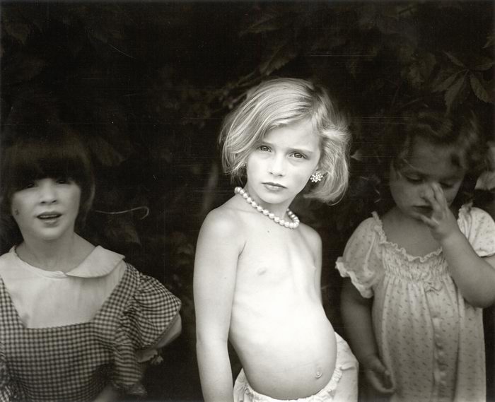
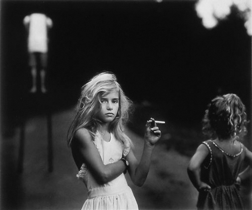
I think Sally Mann's work has a poignancy about it and it's memorable because quite often her subjects have direct eye contact with the camera which is very powerful.  I think her images are very interesting and I like her contrasts between the light and dark.

Life Drawing - Week Four - Tone


This week was really different to our other sessions of life drawing - it was away with line and in with tone! The idea of this week was to look at light and shadow on the body and less about the exact shape of the form (although proportion and shapes were still important; they just took a secondary role to tone). We were using charcoal which I was a bit nervous about because last time we used it in life drawing (first session) I found it quite difficult to use. When we first arrived at the lesson, John (our teacher) got us to start of in our sketchbooks and told us we had 5 minutes to try and capture the light and shadow. We weren't really sure what to do so we started off how we'd always done before and looked at the shape and proportions. My first sketch was terrible! Then John explained more about what we wanted from us; giving us a demonstration of how to go about using the charcoal and I realised we didn't have to be confined to lines and so I just went for it; using the charcoal to make shapes using shade. This produced a much better result and it was then that I began to get excited about this session. I knew I'd really like it if this was how we were going to be drawing. From that moment on I always held my charcoal on its side, decided in my head whereabouts on the page my figure was going to go and roughly put in where I thought the shadows were; creating the shapes of arms, breasts, legs etc. This felt so freeing and I really enjoyed it; I love using charcoal because of its loose, expressive quality and I really felt like I was using it how it should be used. We did four quick sketches on a page and I was quite pleased with them although I found it hard to try and express the idea of hands because you can't really make detail using just shading when working that small.
 After break, we swapped models and we worked on a larger scale with a longer time scale. The principle was the same but it was just to get us used to working bigger. What I liked about this way of working is that because you can't use line to express anything, you have to really look at where the light and dark is on the figure in order to make sense of the form. I'm particularly proud of the figure with his back to us out of these two because I really feel like I captured the shadow and therefore the form well. I think on the one where the model is facing the audience I should have gone darker with the shadow. I also think I didn't get the proportions quite right on this drawing; the legs look a little too short and thick.   
For our final piece of the day, we had to do the opposite of what we'd been doing so far. Instead of looking for the shadow on a light background, we had to look for the light on a dark background. We had to smudge charcoal across the page to create a medium tone background and use either a putty or plastic rubber (I used both because they both give slightly different effects) to pick out where the light hit the body and then after use the charcoal again to add in the darker tones. I found this a lot harder and quite frustrating because it felt very back to front to me. But I'm actually quite pleased with the end result and think it was a good learning curve to do it this way. There's definitely a nice quality to the drawing; it really looks as if light is hitting the figure.   

I loved this session of life drawing; it was really fun just to try a different way of looking at a figure. Although these drawings are a lot less technically accurate, I feel that they are much more expressive and interesting to look at.