Wednesday, 10 October 2012

Photographers!

Tis photography week and we were given the names of 50 photographers of note so I've looked up some of their work to see what kind of thing I like/ don't like:
fayselfportraite.jpgFay Godwin -In a lot of her work I get the sense of solitude and often there's often a feel of ageless time. I think there's something quite beautiful in the loneliness of her work. I also think the images, although they feel melancholy and reflective, have something very calm and peaceful about them which I love. I really like her work in black and white; it gives the image a lovely quality.
CHI-1033+copy+2
Vivian Maier -
What I really like about Maier's work it seems to take a snapshot out of someones life. You get the sense that your looking into someone life through the photo and I find myself wondering about what they do and who they are. You get the sense that there's a story behind the people in the photos and although you don't know them, you want to know their story. I feel a connection to the people in the photos and I think that's brilliant.
 
Wolfgang Tillmans -
WolfgangTillmans-Work01I don't always understand what he's actually photographed but I find his work interesting and I like the colours in it. It's a bit unusual and I like that. It reminds we of water or liquid and the movements within it.
 
Thomas Joshua Cooper -
Sally Mann4I just think Cooper's subject matters are incredible. They really get across nature's awesome power. You've also got to admire someone who travels to these fabulous locations to capture these images.
Sally Mann5
Sally Mann -
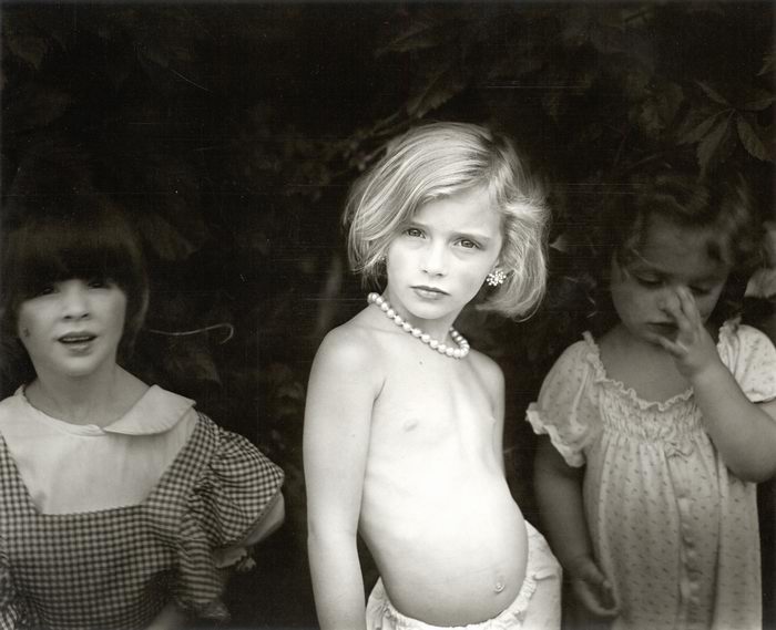
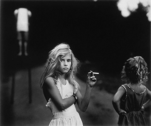
I think Sally Mann's work has a poignancy about it and it's memorable because quite often her subjects have direct eye contact with the camera which is very powerful.  I think her images are very interesting and I like her contrasts between the light and dark.

Life Drawing - Week Four - Tone


This week was really different to our other sessions of life drawing - it was away with line and in with tone! The idea of this week was to look at light and shadow on the body and less about the exact shape of the form (although proportion and shapes were still important; they just took a secondary role to tone). We were using charcoal which I was a bit nervous about because last time we used it in life drawing (first session) I found it quite difficult to use. When we first arrived at the lesson, John (our teacher) got us to start of in our sketchbooks and told us we had 5 minutes to try and capture the light and shadow. We weren't really sure what to do so we started off how we'd always done before and looked at the shape and proportions. My first sketch was terrible! Then John explained more about what we wanted from us; giving us a demonstration of how to go about using the charcoal and I realised we didn't have to be confined to lines and so I just went for it; using the charcoal to make shapes using shade. This produced a much better result and it was then that I began to get excited about this session. I knew I'd really like it if this was how we were going to be drawing. From that moment on I always held my charcoal on its side, decided in my head whereabouts on the page my figure was going to go and roughly put in where I thought the shadows were; creating the shapes of arms, breasts, legs etc. This felt so freeing and I really enjoyed it; I love using charcoal because of its loose, expressive quality and I really felt like I was using it how it should be used. We did four quick sketches on a page and I was quite pleased with them although I found it hard to try and express the idea of hands because you can't really make detail using just shading when working that small.
 After break, we swapped models and we worked on a larger scale with a longer time scale. The principle was the same but it was just to get us used to working bigger. What I liked about this way of working is that because you can't use line to express anything, you have to really look at where the light and dark is on the figure in order to make sense of the form. I'm particularly proud of the figure with his back to us out of these two because I really feel like I captured the shadow and therefore the form well. I think on the one where the model is facing the audience I should have gone darker with the shadow. I also think I didn't get the proportions quite right on this drawing; the legs look a little too short and thick.   
For our final piece of the day, we had to do the opposite of what we'd been doing so far. Instead of looking for the shadow on a light background, we had to look for the light on a dark background. We had to smudge charcoal across the page to create a medium tone background and use either a putty or plastic rubber (I used both because they both give slightly different effects) to pick out where the light hit the body and then after use the charcoal again to add in the darker tones. I found this a lot harder and quite frustrating because it felt very back to front to me. But I'm actually quite pleased with the end result and think it was a good learning curve to do it this way. There's definitely a nice quality to the drawing; it really looks as if light is hitting the figure.   

I loved this session of life drawing; it was really fun just to try a different way of looking at a figure. Although these drawings are a lot less technically accurate, I feel that they are much more expressive and interesting to look at.

Monday, 8 October 2012

Illustration Week! :)

eyes closed (drawing what we could feel)
Illustration Week

I was really looking forward to this week because I think Illustration is what I want to specialise in! I was also really looking forward to drawing!! We began with some theory where we talked about what "illustration" means and what you can do with. I found out that it is much more open then I thought and there's a lot more you can do with it; I thought it was mainly to do with books and magazines but you can do packaging, advertising and use it in fashion such as designs to go on clothing. This was really good to hear because it means there's a lot more flexibility and scope for a career in the future. We also looked through some sketchbooks of previous students - I found this really useful and helpful because it gave me an idea of what to expect if I did chose Illustration. It really did look like the kind of thing I'd want to do so I'm pretty convinced at the moment that Illustration is the subject I want to continue with. (However, I shall still enter each week with an open mind!)
using our left hands
After lunch we did some quick, observationally based activities with a twist! We were each given one natural form (such as a shell, seed pod or dried plant) and told to hold it in our hand; we had two minutes to draw it with our eyes closed and to draw what we could feel. We filled a sheet of paper with 4/5 objects using this technique and then moved on to the next task - draw with a continuous line. Another task was to draw while looking only at the object; we couldn't look at out drawing or the paper and the last task was to draw using our left hands. This really freaked me out at first because I'm naturally a slow drawer and I like to have time to think about what I'm going to do and we simply didn't have time with these activities. Although it was quite alarming, I think its really good for me to be made to do this because it'll help me be quicker and not to worry so much about my work. The idea behind these tasks was to get us to really look at we were drawing and I was definitely doing that! I just found it hard to translate what I was seeing onto paper. But it really helped in making me really focus and look at what I was drawing which is key in Illustration.
drawn using a stick with a graphite
 pencil attached to the end
After these we were given a stick each and had to attach a graphite pencil onto the end of it. We placed a sheet of paper onto the floor and stood over it holding the stick at the very end and drew our shoes! It was really difficult to make marks where you wanted to but I was concentrating very hard on what my shoes looked like so I could get move the stick in the right way. I did enjoy this even though it was frustrating because it was a completely different way of drawing that I've never tried before!


On the second day, we warmed up using a similar technique to how we drew the natural forms only this time we were drawing from stuffed birds. Our teacher wanted us to look at the shapes within the birds and not just focus on the outline because that will help us get the proportion (rather like in life drawing!). I started to get that on the very last bird (toucan in green pen). I'm still finding hard to draw so quickly in so little time but I'm starting to find that I'm more relaxed now and don't worry about it being "prefect" so much - I just try to capture the essence.
We then worked on a much larger scale, only focusing on one bird and doing two sketches on one piece of paper. We did one in graphite pencil and the other in charcoal and given seven minutes for each. I find this was a really good time frame for me - long enough to get quite far with the drawing but short enough to make you stay loose but focused. I loved using charcoal; I find there is something very freeing about charcoal that makes you just go for it - it's such a lovely loose media!

After lunch we began to use ink - brown and black. We were told that this was the stage where we would be pushed to be experimental and that this was about the journey of the picture rather than the end result. It was about change and trying out things just to see what would happen. This was quite an exciting prospect as well as a rather alien concept but I was eager to embrace a more experimental side even if I found it difficult. I know I get precious about my work when I've got it to a stage I like and I know that's a habit I've got to break because sometimes by pushing that extra boundary you can make something good into something brilliant. And art is all about experimenting and exploring so it's something you have to welcome with open arms. However, I also know that you've got to realise when to stop too. We did all sorts with these two pictures; used a paint brush and a stick to draw with, used two different colours of ink for different effects, sprayed it with water to make the ink run, bleached it to make the ink fade, used collage and masking tape to change bits and used white emulsion paint to lighten our drawings.
I didn't really enjoy doing these because I didn't like the bird I was drawing. It was fun to try all these different experiments (especially using water to make the ink run because that had some really interesting effects that I liked a lot). I just didn't find the puffin as inspiring as the toucan had been to draw. I loved the process though and that was the whole point of the exercise.

After we'd completed these drawing we moved onto a larger scale - this time on brown paper to be able to get a really big drawing. I decided to draw the toucan again because I loved drawing it last time and I wanted to try it again using the techniques I'd been shown. This time we also got to use oil pastels too to introduce a bit more colour into our work. I found this harder to change and be quite free and experimental because I liked my picture more but I tried really hard to not tighten up too much and keep that loose feel to my work.


On the third day we started designing very simple books to put our illustrations in (see in sketchbook design work). I thought this was useful to be able to see the practical side and how it's important to know what your illustrations are going to go in and where.
It can influence your drawing style, scale of drawing, etc. I decided to keep my very simple with the theme small to big with the illustrations of the green finch as the small bird, the toucan as the medium bird and the chicken as the big bird.

I have really enjoyed this week and have definitely loved being shown new ways to generate ideas or inspiration. I think it's been really good for me to learn how to be looser and not to worry about the image to be "perfect" - an image is much more interesting when it's not perfect and when you can perhaps see the journey to get to the final outcome. I would really like to carry this on and will almost definitely specialise in this subject if I can!


Sunday, 7 October 2012

Illustration Magazine - VAROOM!

So... I was flicking through a few illustration magazines because it's illustration week and a couple of images caught my eye in Varoom! They were pictures of Hogarth Brown's work accompanying an article in which Brown talks about trophallaxis and how we, as humans, are taught to consume certain ideas and then turn those ideas into our own desires and aspirations. What initially got my attention was the image opposite called N.A.S (National Alcholics Service) because I thought it was a stained glass window and I find them very beautiful. However, when looking closer I realised that his window depicted a vulgar, drunken scene and I found this very interesting. My initial assumption that is must be something beautiful and most probably holy was completely shattered and there's something that makes you sit up and take notice when you're completely wrong about something; it's quite a shock. I like the way Hogarth Brown is suggesting that we almost worship this vulgar conduct and it's seen as desirable and the thing everyone should be doing. I also like the way his placed the ambulance with the man urinating off the top. It makes the point of showing people what paramedics have to deal with and begging the question - is this what ambulances should be dealing when there are really ill people out there who actually need them? It creates an awareness and makes you think about whether this is right.  

Thursday, 4 October 2012

Illustrators I like :)

This week it's Illustration so I've been researching some Illustrators to find out what kind of styles I like or think are interesting:
Gina Triplett:   
I think the (usually faded) colours Triplett uses are beautiful; they create a richness to her drawings which give the pieces an easy sophistication. I love her use of line; the pieces seem to flow and are very easy on the eye. She often uses circles in her work and this creates a very calming effect although there is usually quite a lot going on in her pictures. I really like that she uses ink; it just adds a lovely quality to her work. I love that she uses inspiration from animals and nature (particularly flowers) but stylises in a quietly bold (if that makes any sense!) way.


Finn Campbell-Notman:
I find his work quite odd and sometimes rather sinister but there's something that I like about it. He often uses dark, quite muted colour that creates a unsettling atmosphere and gives the images an edge. Using darker colours gives the pieces a sense of depth. His work feels quite darkly elegant and I like the stylised shapes and detail. 


Baby Center Magazine


Keri Smith:

I really like this simple, yet quirky style. There's something that feels very fresh and cute about it. These images feel very friendly and welcoming; there's a real sense of familiarity to them. I like the easy, clean line and the subtle colour scheme of pale blue, pale coral, beige and white.


Chris Riddell:

I love these illustrations - I think his use of line is just brilliant. I've loved his work since I was 10 and started reading the Edge Chronicles (written by Paul Steward) which Riddell illustrates. I think his drawings of magical creatures and monsters are wonderful; they have a great presence and feel quite dramatic in black and white.    


Sarah Beeston:

Beeston uses incredible clashing colours and her pieces are always extremely busy and with the page filled to bursting. Sometimes they feel a bit over top and crazy; too much going on and the colours are so in your face. But in a way I quite like this; it feels fun and exciting - and definitely never boring! Her images are bold, bright and quite often seem playful and youthful.


Tony DiTerlizzi:


He illustrates The Spiderwick Chronicles and I think his detailed magical creatures are beautiful. I'm very fond of the fantasy genre and so I love well drawn creatures from it. I love the muted colours and the delicate lines. His work is very subtle but really lovely. 

Life Drawing - Week 3


This week we focused on lying poses; looking at foreshortening and how it effects our drawings. A lot of emphasise was put on the idea taught to us by Mik last week about looking at the body as a map and finding reference points in order to get the proportions and shapes of the body right. Mik gave us a demonstration about half way through the day of how to start looking at the body and where to begin our drawings. He explained it as an under drawing that once, you had drawn the form correctly, would be the basis for your actual drawing so could be very light sketch. He told us to hold our pencils at the end so we would get the very lightest of marks on the paper. This was really helpful; it made me realise that this was just the beginning of the drawing but it was the most important part because this was where you had to get the form and proportions just right because it will shape the rest of your drawing. Mik also told us to keep finding the form with straight lines to begin with and then once you were sure you had the put the curve in. You can see in my drawings that after Mik's talk I really started to look at shapes within the body and using points of the body to reference other parts.
I really enjoyed this week; I thought the poses we were given were interesting and it made me want to draw them. Although for some reason I found it much easier to start with the curve of the hips rather than the head. This week I tended to draw the head after I'd sketched out the rest of the body. I'm not too sure that that is good practise generally but it seemed to work for me. I really like the technique Mik has shown us; I find that I'm looking a lot more at the shapes of the body and my drawing and comparing. I'm much more open to changing my drawing if it's not right now even if I think that particular bit looks good on its own.  I can see a huge improvement from week to week and that's a really good sign.  


Tuesday, 2 October 2012

Sara Fanelli


Sara Fanelli - 

I love all her different fonts! I think the random collection of words in capitals/ joined up/ dotted underlined/ big/ small handwritten fonts are really interesting and fun altogether. It makes her work feel like a notebook which really appeals to me. I like the way she uses collage to add depth to her work and I also like the way she uses line to create a images that feel quite childlike.  
I find some of her work a little odd and disconcerting - her characters sometimes feel sinister and creepy  even when they are not meant to be. I also find that some of her work lacks an emotional connection with the audience - her characters sometimes feel flat and expressionless which makes it hard to connect with them. 


02.jpg
Book spread from ‘Sometimes I think, Sometimes I am’