Sunday, 30 September 2012

Graphics Week

Week Three - Graphics
We started this week learning about about the different disciplines that stem from the very broad term "graphics" such as typography, packaging, web design, branding, advertising etc. I think this was really useful; it gave us an insight into what we could go into if we chose Graphics and what kind of job we could get into. We then watched a short clip of David Carson giving a talk and another one of him being interviewed which was really interesting; I love hearing about artist's thoughts and ideas.
 
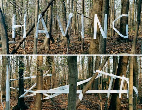
We had a session of typography - I really enjoyed this. We inked and collaged 4 simple backgrounds. Then we took letters we liked from packaging like golden syrup tins, Marmite jars etc and drew several thumbnail sketches of the the letters in different positions. We picked our favourite thumbnail of each of the 4 letters and drew them on the backgrounds. But there was a twist - one we had to draw without taking our graphite pencil off the page, the next we had to draw with our left hand, another we had to draw using a stick and ink - holding the stick at the very end (this was really fun!) and one we had to fashion out of masking tape. I thought this was brilliant - it was great to use unusual techniques and media. And some produced interesting effects that I actually really liked - I thought the stick and ink technique looked really good.
 
We received our brief for the week -  We began to generate ideas using spider diagrams to explore different ideas or interpretations of the words. We then used thumbnail sketches to develop a typeface that expresses or convey a idea of each word. After that we used collage to explore colour and shapes that we feel reflected the feeling of each word. I like this way of working; it makes sense to me. I enjoy going through the process of designing. We then put the words and backgrounds together and saw what went well together. Finally we used Photoshop to make our design look more professional. I'm quite pleased with the end results. I have enjoyed this week - I've found out a lot about Graphics and how the course may work. I liked finding out about the different graphic designers and how the communicate with their target audience.  

Saturday, 29 September 2012

Graphic Artists


Noma Bar:

Noma Bar uses simple graphic images to portray images that deal with political and social issues. I think the way he uses negative shape is really clever. I also like the way the bright colours and simple shapes seem to indicate naivety and give off a feel of childish innocence, yet when you look again you realise his work is actually pretty hard hitting. I think that really makes an impact because it shocks you as the image isn't what you thought it was. This, along with the striking block colouring, makes the image memorable which is really important for a graphic designer.
Stefan Sagmeister:
Stefan Sagmeister at Vienna Design Week
I find this piece of typography really interesting. I like the way that from one angle it looks like a load of tangled white ribbon and yet from another there's a word or message. It plays with your perception of the world around you and I find that really intriguing. I like that he's placed the text outside too; it shows that it's not restricted to a page. There's another piece by him where he's written "always" on a bunch of lilies and then left them to wilt and die so you can't see the word any more; there's something very melancholy about that piece and I find something very beautiful in that.
 
Alan Fletcher:
I like Alan Fletcher's design for the Victoria and Albert Museum. I like how simple yet distinctive it is. I love that there's a a reflective symmetry about the piece as the "A" is just a upside down "V". I also think the way the flick on the "&"makes the "A" is really clever. I think there is a quiet kind of elegance about this piece that makes it seem like a classy, interesting place to be, yet still manages to be quite bold and memorable.     
Wim Crouwel:


Crouwel's work feel very modern to me although he's actually he's an older designer born in 1928 but still won awards in 2009 (the Gerrit Noordzij Prize). I like his use of bright colours; I'm very drawn to bright, fun colours. I think the way he's used these fun colours with this very carefully formed, typed looking font is interesting.   
Kris Sowersby:

I really like the colours Sowersby has used in this piece; they compliment each other beautifully. I also like the play on words; the text says "flour" but the font seems to suggest budding "flowers". The colours also remind me of flowers and summer nights. I like how decorative the font is too; it's interesting to look at.
Pep Carrio:
 

Pep Carrio works in a journal everyday to generate and develop ideas. I think this is great. What I like about this piece is that it stirs emotion in me. I don't know exactly what it's about; whether it's being lost, confused, feeling isolated or trapped (just some of my own interpretations) or none of the above. But it certainly gets me thinking and feeling and that is what every artist wants.

Graphics Magazine - Computer Arts

Icon-february-12 293As it is Graphics week, I thought it would be a good idea to go to the library and have a look through some Graphics magazines. I found an article I thought was interesting in Computer Arts about the designs of the front cover for Icon magazine.

Icon was focusing on food and what was going to happen in the future and had asked Zim & Zou to create a "vibrant and striking image" for issue 104. They wanted the image to be themed around what the future holds for food. The co-founders of Zim & Zou, Thibault Zimmermann and Lucie Thomas, created a 3D burger with a weird, unnatural colour scheme; blue, purple, lime green, bright pink.

I really liked this - I certainly think they produced a "vibrant and striking" image - and the unnatural colours make me think of additives and E numbers which are big issues in the food industry at the moment. It is also making the point that more and more food is being made by factories and machines, rather than people, which is quicker, easier and cheaper but not necessarily better for us because so much fat and sugar is being pumped into it to make it taste "better" or to last longer. It raises the issue that we don't really know whats going into our food and soon our food will almost start to look unrecognisable.

Thursday, 27 September 2012

Six Graphic Designers I like :)

Alphonse Mucha -


I think his work is beautiful; I love it! His highly decorative images are very attractive and make me want to look at his posters for ages to see every detail - which is a really good thing because it makes you take in all the information about whatever he's advertising. I really like his flowing use of line and the stylised, natural forms. I love the way he uses flowers and jewels altogether to create a highly opulent image. His women often wear a far away look on their faces which gives the piece a dream-like quality which gives the impression desirability - you want to be in this wonderfully, beautifully decorative place with this beautiful women. Desirability is key in advertising; you have to make whatever it is you are advertising appealing to your target audience so that they will buy the product.
Tadanori Yokoo - 

Yokoo's style is Pop Art and I really like the simple, stylised images. I love his bold use of vivid colour; the pink and the yellow looks really good together. I like the highlight of light blue; gives the picture a bit of lift. There's a lot going on in this poster yet it doesn't feel too busy - I think that this might be because the style is clean and to the point (straight lines and block colours) so it all seem to fit together. There is a nice balance throughout the poster which I like.
Ed Fella -

I like the way Fella uses different fonts for the different words. This style really appeals to me and I like the the soft, pastel colours he has used. I like the free hand typeface; I prefer more flowing, handwritten fonts to typed looking text.


Modern Dog -

I love that vivid pink writing; it really stand out and makes you want to look at it. The bright colours grab your attention and also make the poster feel upbeat. I like the abstract, orange shapes in the background; they create a nice contrast with the pink and add a bit more interest to the poster without taking the focus off the text which is the most important bit. I love the cut out looking type of the "your" - makes the piece feel youthful and fresh. I also think the highly coloured, very decorative butterfly adds to the fun, bright, arty feel of the piece. Modern Dog often only uses a two tone colour scheme (and black and white) to create bold, fun pieces.


Jewboy Corporation (Yaron Shin) -

What I like about Yaron Shin's work is that a lot is suggestive; take Body Parts, for example, at first glance it's very shocking and apparently vulgar yet on closer look you actually see that it's just a mass of flesh coloured shape and it's your own mind that's tried to make sense of it and turned it into something dirty. Shin obviously wanted you to see something in his picture and so chose where to place things carefully and I think that's really clever. I don't like the piece itself but I admire the way he's created this image; it plays around with how we see things and touches upon the darker side of human nature. I think it's a really interesting technique.
Soundtrack of Our Lives


Patent Pending Design -

I really like this piece of work from Patent Pending Design but I'm less fond of some of his other posters. I liked this one because I thought it was a bit off beat and quite quirky. I love the simple yet interesting design - it feels quite understated and cool. It's not shouting at you because the colours are warm instead of bright but it draws you in by being a bit different and intriguing.


Saturday, 22 September 2012

Applied Arts (Metal Work) Week

Second Week - Applied Arts (Metal Work)
We started off the week by generating inspiration from either natural forms (such as lots of different, interestingly shaped dried seed pods) or mechanical, metal objects. I chose a seed pod because I'm more drawn to natural forms. We made a view finder and placed it on a part of the object we found interesting. A quick five minute sketch later and we chose another part we found interesting and drew that over the top of the first image. The idea then was to find an shape we liked in the picture we'd made and design some jewellery around that shape. I enjoyed it a lot. It was an different way to gain inspiration that I will perhaps use again in the future especially if the work is heavily dependant on shape. 
We had a tour of the workshop and shown how to use some of the equipment - such as the spot welder, the fly press, a micro welder and the rolling machine.
We then got given our brief for the week which was to cover a wooden cube in metal sheets in the style of the artist Junko Mori. I researched her and found this website really useful -  http://www.a-n.co.uk/artists_talking/artists_stories/single/81484 - it gave me a good, basic understanding about Junko Mori and her work. It was clear that Mori is influenced by organic, microscopic forms such as bacteria, viruses and pollen so I looked as those types of images to to gain inspiration for my piece:

bacteria
pollen


plankton

I used the images I found to create simplified organic shapes using wire and the spot welder to imprint onto the copper, yellow, gold metal and tin-plated steel using different techniques - the fly press and rolling machine. I loved using the copper because I had to clean it using a special machine; it was so shiny when it was finished - it looked lovely.

I was really quite pleased with my base although I think I could definitely improve my hammering skills! I love the weird, organic shape on the different coloured metal. However, I wanted to get a bit more Junko Mori's influence into my work so I started making organic shapes by hammering different parts of wires to make interesting shapes and welding into uncontrollable forms. I started to attach them to the base as you can see in the photos. Unfortunately, I ran out of time to get all of them on so my work is incomplete but I am pleased with what I have achieved so far.
Here are the rest of the forms I wanted to attach to my base. I do like my piece because I think it reflects Junko Mori's work but I've also made it my own by using 2D images as well as 3D and creating my own organic shapes. I've really enjoyed metal work - it was so much trying trying out all the different machines and seeing what different things did to metal. I definitely want to have another go at some point!

Wednesday, 19 September 2012

Life Drawing - Second Session


We drew two sketches per A1 page in this session. This is my first page; the figure on the left was my first go. As you can see the body started going wonky and I was trying to draw in all the detail straight away. We got 20 mins to draw this one and afterwards Mik sat us all down and gave us a demonstration on how he starts drawing a figure. He said that he begins to draw with straight lines and look for the shapes and not to look at the detail until you've got the main frame of the body. He talked about making a map out of the body and looking for reference points and looking for negative space.He also said that it was important not to focus too much on the same point and move around on the drawing. This was really helpful; I found it much easier to find the figure in the second drawing.


Mik taught us to look at angles and how to use our pencils to to see if them getting it right. I found this very useful to know as I used it a lot to check I was getting the correct angles; it made a real difference to my figures. Mik said that what I was doing was good but he wanted me to be more sketchy to begin with and try to sketch the whole figure in the time we were given. I was feeling like I was being too slow and careful; I need to speed up a bit and try to get the whole figure. I definitely feel like I have improved from last week though. 
For the first time we had to draw a model who was sat down. This was a bit alarming but actually a really good challenge; it was nice and refreshing to draw a different position. We had slightly longer to draw these two images - 30 mins - which meant I managed to get the whole figure in - even the feet!! I started using hatching to shade in the figure on the left. I found the second figure harder to draw because it was a more difficult angle, in my opinion.
Mik thought we were able to cope with a harder position and he gave us an hour (give or take) to draw. I've quite happy with the shape and I started shading using the hatching technique like Mik showed us. The only thing I found difficult was towards the end when I wanted to put more detail in. I was so used to looking at the shape and using straight lines so it was weird going back to detail again!


Next week hopefully work faster and work on the finer details such as toes, face and fingers!


Saturday, 15 September 2012

Fine Art Week

 Week 1 - Fine Art
On the first day we had a session of theory - we learnt about and discussed metaphors in art. We talked about how metaphors are used to express ideas and emotions. We also thought about metaphors in song lyrics to inspire us in our art. I liked the song lyric "slow dancing in a burning room" from Slow Dancing in a Burning Room by John Mayer that describes the break up of a relationship using the metaphor of fire.
On the second day, we were told to be very direct; draw/paint around objects, use the projector to draw around the shadow of the object, or paint onto the object and print it onto your page. I didn't really get it at first and my first attempt was quite weak and uninspired as you can see opposite. I did like the leaf print (bottom right). I painted a leaf, placed it on the paper, then stood on it and the pattern of my shoe was imprinted in the paint in the shape of a leaf which I thought was really interesting and unusual.
Later on in the day, I realised that the point of this exercise was to think about composition and how things looked on a page together. Bearing that in mind, I started a new piece and instead of randomly placing objects, I thought about what I was doing. I also changed from drawing round the objects themselves or painting them and printing them on the page to projecting them and drawing round that. I did this because we were working on huge pieces of paper and I thought that bigger images would make more of an impact and that on my last piece, the small images got lost. I like this piece much more and it makes more sense to me. I really like the plant I drew in charcoal - it's bold and an interesting shape. In the middle there is an image of rope which I drew around in graphite pencil - this is the weakest part of the piece because it doesn't stand out like the blue and pink paint and the charcoal. I wouldn't use it again on a piece like this.  
We started thinking about how we could portray the metaphors we had chosen using only the objects we could find in the room and working directly with them. I was interested in looking at fire and flames and the fiery colours such as red, yellow, orange and blue. I was unsure how I was going to do this with just things we could find in the room but then I saw a plant and in the bottom of the plant pot were dead, and dried up leaves. I thought that the twisted shapes could look like flames when projected onto the paper. I did one layer in red, then moved the leaves into a different positions and painted loosely around them in orange and again with yellow. I think it was really successful and I'm pleased with the outcome. I then added in some blue "flames" which were prints of living leaves. I think this has really made a great image for fire and I like the way the flames start down on the right and spread across to the top.

We started to think about our metaphors in more depth on the last day. I was still interested in the image of fire and I liked the using the leaves and wanted to see what more I could do with that. I started to print leaves covered in three different tones of blue all over a cardboard box and then to help it to dry I placed a sheet of black paper over it several times to take out the excess paint. When I peeled it off the the black paper a interesting flame pattern had formed. I really liked this and I decided to try this with different colours and then I tried layering orange and yellow over the blue. I made a series of these prints and together they looked quite effective.

This week I have learnt to think about composition and to try putting things together to see what will happen - because sometimes they will work really well together.


Thursday, 13 September 2012

Life drawing - first lesson!

So ... life drawing!
We had to draw with charcoal which I was quite excited about because I've always enjoyed drawing with charcoal before. Although, it turned out to be much harder than I thought it was going to be; we got taught how to hold charcoal properly and I found it pretty difficult and rather odd to begin with! It's very different to how you hold a pencil.
We also have to stand an arm's distance away from the paper so that we can see what we're drawing and have the easel at 45 degrees that we can see our subject. I kept forgetting and getting really close to the paper but I think that will come with practise.
We got given 5 mins for the first few drawings which was a bit alarming as naturally quite a slow drawer and I like things to be precise. But I'm glad to by put out of my comfort zone - hopefully it'll push me to be a better artist!
<< There is my first attempt - started out too big because I didn't begin with the head (oops!).


My second go was better scale-wise - I started with the head and carried on from there so I managed to fit the whole body on this time. Huzzah! However, I didn't get the width right; my pictures a bit too wide and so the head looks too small. I didn't have time to do the feet either (a recurring theme!)                                         >>
At this point, after we'd done two quick sketches, Dave showed us how to measure using our charcoal so that our figures would be in proportion. As a basic guide, the body should be 7 and a half heads long.
He also told us to be aware of the bone structures underneath the flesh and use those as reference points when drawing the body. This will help us not to go too wide.
<< I think my third attempt is definitely starting to look a better although it's a shame I didn't manage to get the complete body in. I was busy concentrating on getting the proportions right that I ran out of time to actually draw!
I found it quite difficult to use the structural reference points because I wasn't sure how the bones (and muscles and what-not) were working together from those perspectives and positions. I've only ever drawn people front on so it was a (good and interesting) challenge to draw from a different angle (if rather difficult!)


In the afternoon we changed models and had a woman to draw. I'm pleased that we got the chance to draw both as women and men are very different from each other to draw. We got longer to draw the woman - 20 mins (which still seemed like hardly any time to me!)                                                                                      We then had a session of quick, three minute poses to sketch in our books in pencil. I thought that I'd be better at this but actually I found it really awkward trying to stand, hold my book, look at the model and draw! I hadn't got my speed in sketching either - was far too slow; didn't even manage to draw half of the model before time was up!                                                                                                                                                                             To be honest, I'm not very pleased with my day's progress - I'm disappointed with the way my work turned out. I feel like I can do much, much better than this! I found the charcoal quite hard to draw with as the body and face is very detailed and I found it hard to get good detail in. But as a starting point, it's not too bad. I really enjoyed my day and I've learnt a lot. I'm hoping that I improve throughout the weeks because at the moment this is not my strong point. Basically life drawing needs some work!!                                                                                         
  Target for next week = work on face and feet and speed of drawing!