Noma Bar:
 Noma Bar uses simple graphic images to portray images that deal with political and social issues. I think the way he uses negative shape is really clever. I also like the way the bright colours and simple shapes seem to indicate naivety and give off a feel of childish innocence, yet when you look again you realise his work is actually pretty hard hitting. I think that really makes an impact because it shocks you as the image isn't what you thought it was. This, along with the striking block colouring, makes the image memorable which is really important for a graphic designer.
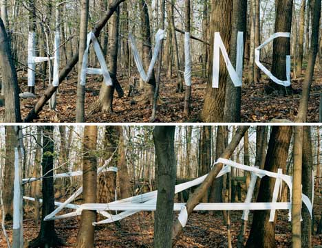
Stefan Sagmeister:
I find this piece of typography really interesting. I like the way that from one angle it looks like a load of tangled white ribbon and yet from another there's a word or message. It plays with your perception of the world around you and I find that really intriguing. I like that he's placed the text outside too; it shows that it's not restricted to a page. There's another piece by him where he's written "always" on a bunch of lilies and then left them to wilt and die so you can't see the word any more; there's something very melancholy about that piece and I find something very beautiful in that.
Alan Fletcher:
 I like Alan Fletcher's design for the Victoria and Albert Museum. I like how simple yet distinctive it is. I love that there's a a reflective symmetry about the piece as the "A" is just a upside down "V". I also think the way the flick on the "&"makes the "A" is really clever. I think there is a quiet kind of elegance about this piece that makes it seem like a classy, interesting place to be, yet still manages to be quite bold and memorable.
Wim Crouwel:
 Crouwel's work feel very modern to me although he's actually he's an older designer born in 1928 but still won awards in 2009 (the Gerrit Noordzij Prize). I like his use of bright colours; I'm very drawn to bright, fun colours. I think the way he's used these fun colours with this very carefully formed, typed looking font is interesting.
Kris Sowersby:
 I really like the colours Sowersby has used in this piece; they compliment each other beautifully. I also like the play on words; the text says "flour" but the font seems to suggest budding "flowers". The colours also remind me of flowers and summer nights. I like how decorative the font is too; it's interesting to look at.
Pep Carrio:
 Pep Carrio works in a journal everyday to generate and develop ideas. I think this is great. What I like about this piece is that it stirs emotion in me. I don't know exactly what it's about; whether it's being lost, confused, feeling isolated or trapped (just some of my own interpretations) or none of the above. But it certainly gets me thinking and feeling and that is what every artist wants.

No comments:
Post a Comment